
How To Make A Bad Chart
As a survey researcher I spend a lot of time thinking about the best way to ask questions that help people understand a phenomenon better. Asking the right question is crucial, but not where it ends. You need to be able to show the results in a way that makes it easy to understand what the data is telling you. And then you move into what to do now that you know this.
But too many people fail at the intermediate part. They make it really hard to understand what the data is telling us.
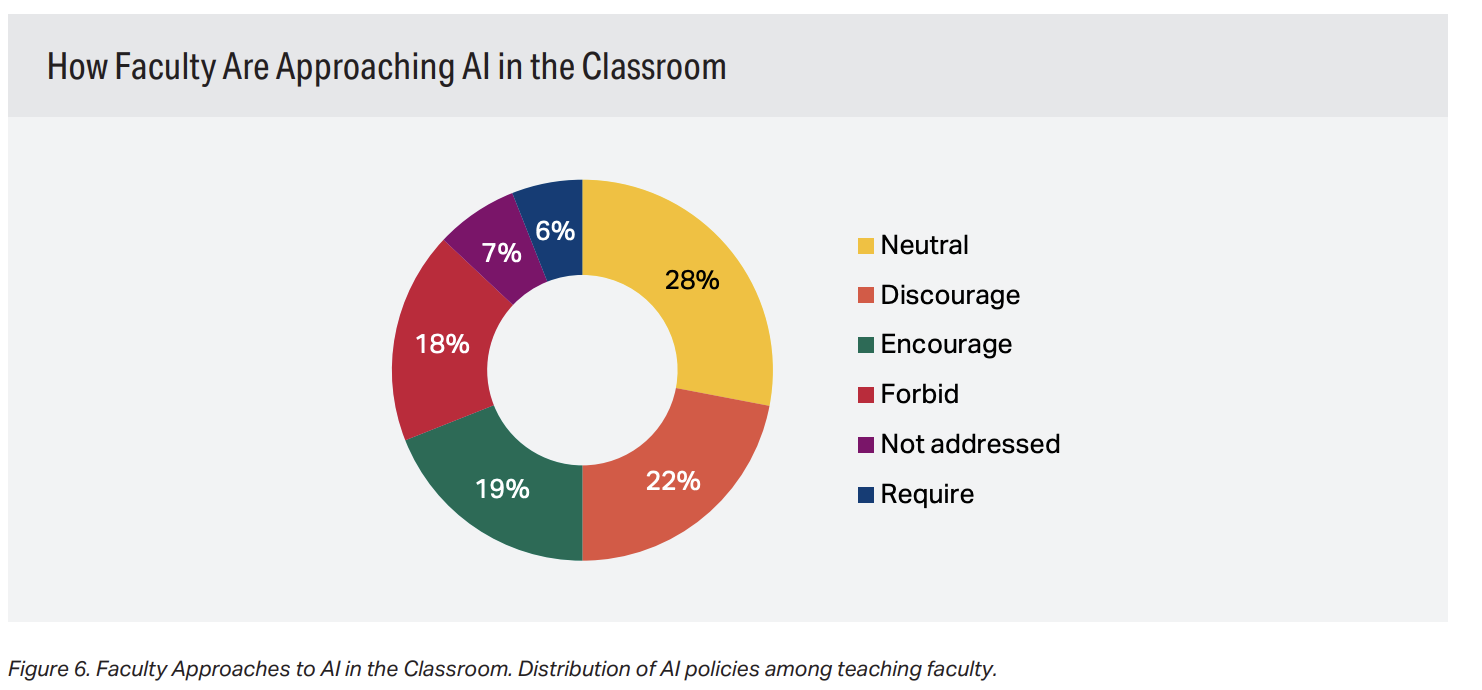
Look at this chart. An infamous “donut” chart.
The first thing you notice is that there are a lot of slices to the donut and that each has a different color. When I see charts with different colors I look to see what the colors are telling us. How is this helping me organize the information? In this case, I have no idea what the colors are telling me, other than that these are different responses to the question in the survey. In fact, they distract me from what the data says because I can see no pattern.
Let’s look at the answer options. They seem to have a hierarchy. If I were to list these options in a survey question I would do it like this, so that they give meaning to how they relate to the other options:
Require
Encourage
Neutral
Discourage
Forbid
Not addressed
This starts with the most positive use (“Require”) associated with using AI and moves gradually to the least (“Forbid”), and adds “not addressed” at the end. The relationships between the response options are important to give context, and so I would preserve that in the depiction of the results. In this case, the chart creator has used prevalence of responses are the organizing factor as the donut starts at the top with the most prevalent result (28%) and then moves to the next (22%), and so on around the circle. This can be a great organizing factor, and one I use a lot. But it doesn’t make sense here as it loses the important relationship between the response categories. And a donut graph is a poor way to depict relationships between items.
Here’s how I would depict the results. It organizes the material by the order of items and uses color patterns that people already identify with and provide meaning to the way the responses relate to each other.
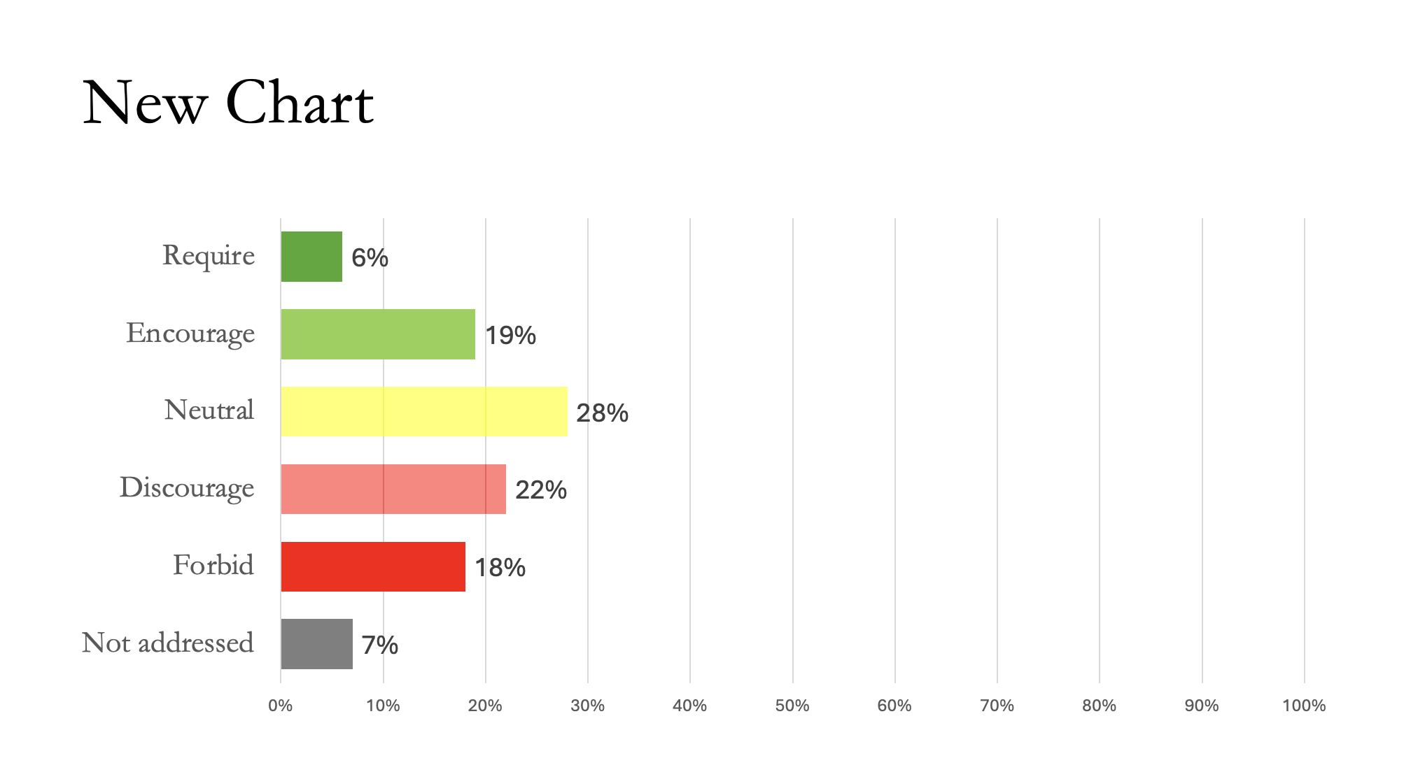
You can easily see the answers that are leaning in favor of AI, in the green, neutral in yellow, and those that are not in favor to varying degrees. The relative percentages are easier to compare and understand. And now, instead of trying to figure out what the data is telling you, or just giving up, you can talk about what this means in terms of the topic being asked about.
Because that is why we asked the question in the first place.
